Data Nerds UNITE!
Interested in the data available with the location of where you live? Check out www.city-data.com, and you can plug in your address to drill down to the level of education achieved by your neighbors! Of course, the info is only as good as the data provided, so if you achieved a degree by completing a certificate by Google and consider yourself a doctor, um...it may be skewed. So, beware of data!
-----------------------------------------------------
The following info was provided by Access NC:
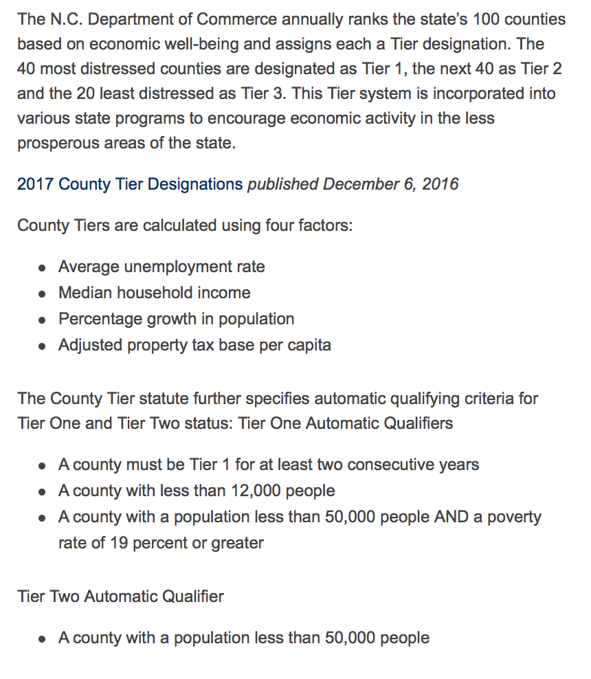
This data shows the high concentration of poverty (orange) as well as the areas (light blue) that are spotlighted by the government and are given tax credits for folks residing. The areas that are grey include both.
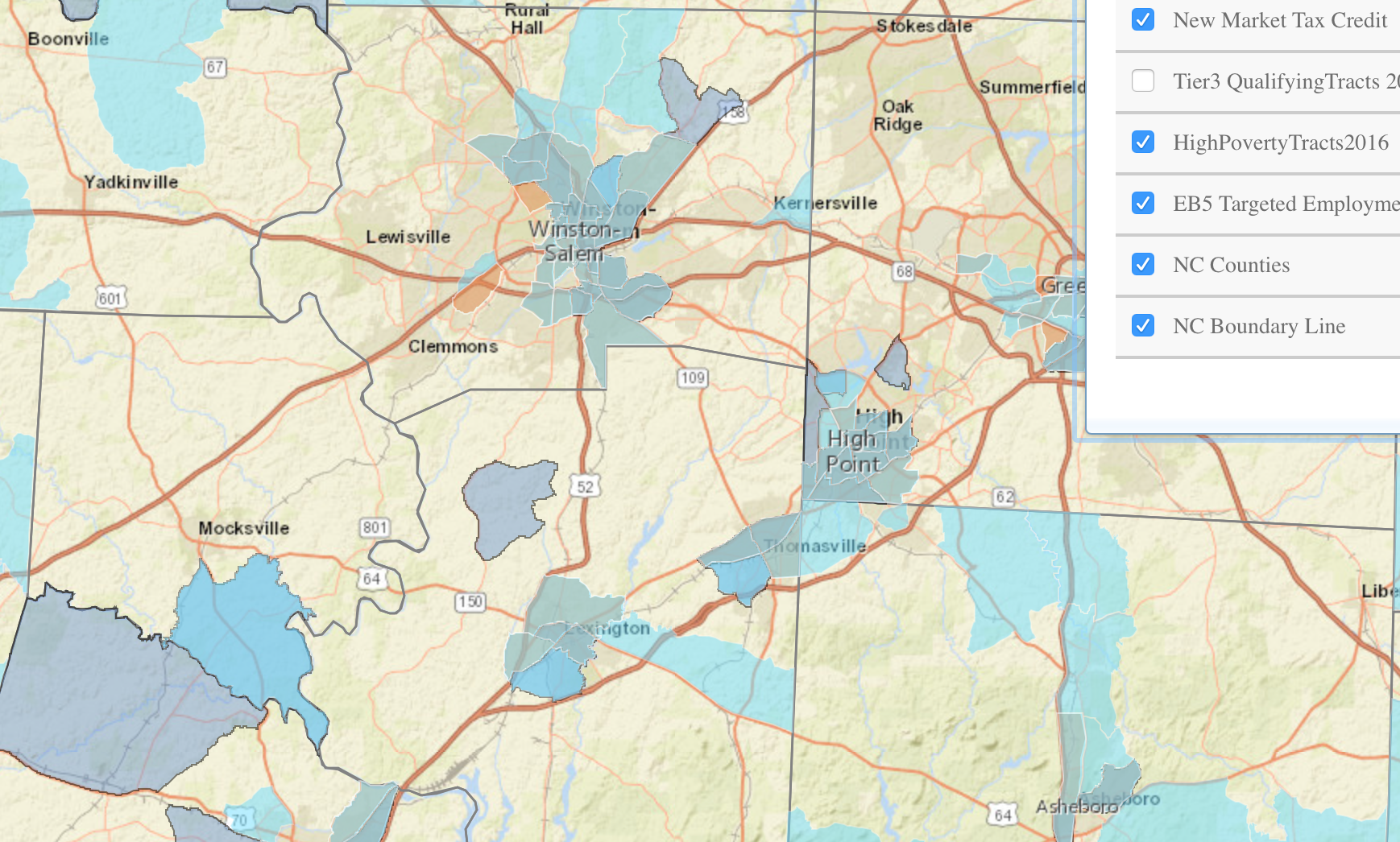
On the flip side, however, Forsyth County is a tier 3 county, which is a distinction which is hard to come by! Davidson is a tier 2 county, mainly because the county is so large, it is represented by all economic classes.
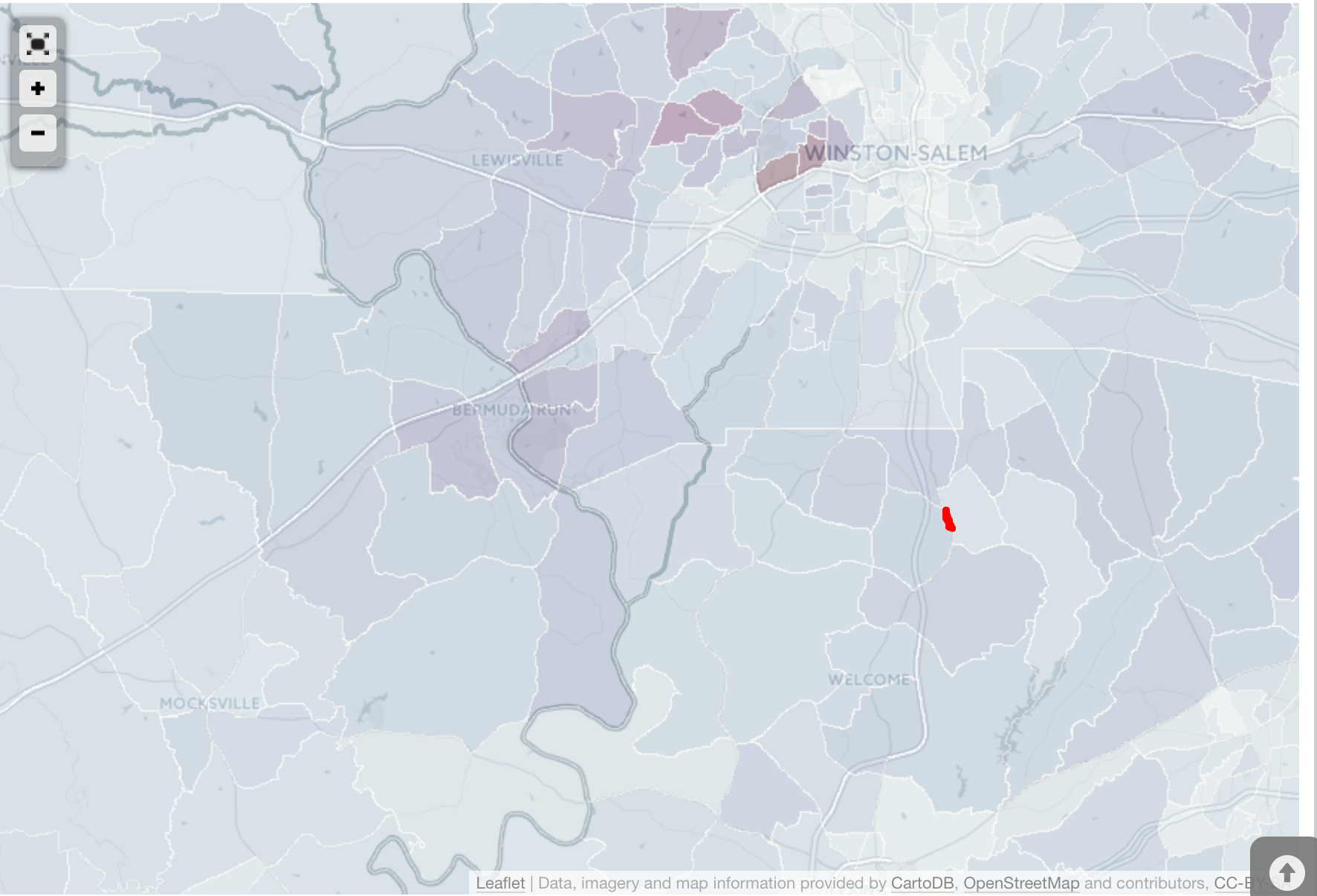
The northern part of Davidson County is classified as bedroom communities. On this map from City-Data.com, the darker spots indicate those with the highest areas of wealth, and the lighter areas indicate a more rural or an area of poverty. (The area where I live is indicated by the red dot, and is largely a farming community, but on the cusp of the more affluent area- and the darker blue is also bordering the main thoroughfare of the area.)
